The idea behind the GraveComClave is to create a community that helps music artists who want to develop and expand their concept by reducing the time spent working with multiple partners and enabling their growth with a w2w service and a vast network of other artists.
Brand Tone
Helping the unknown & underdog artists show their true value.
Brand Identity
The mysterious artist underground world revealed.
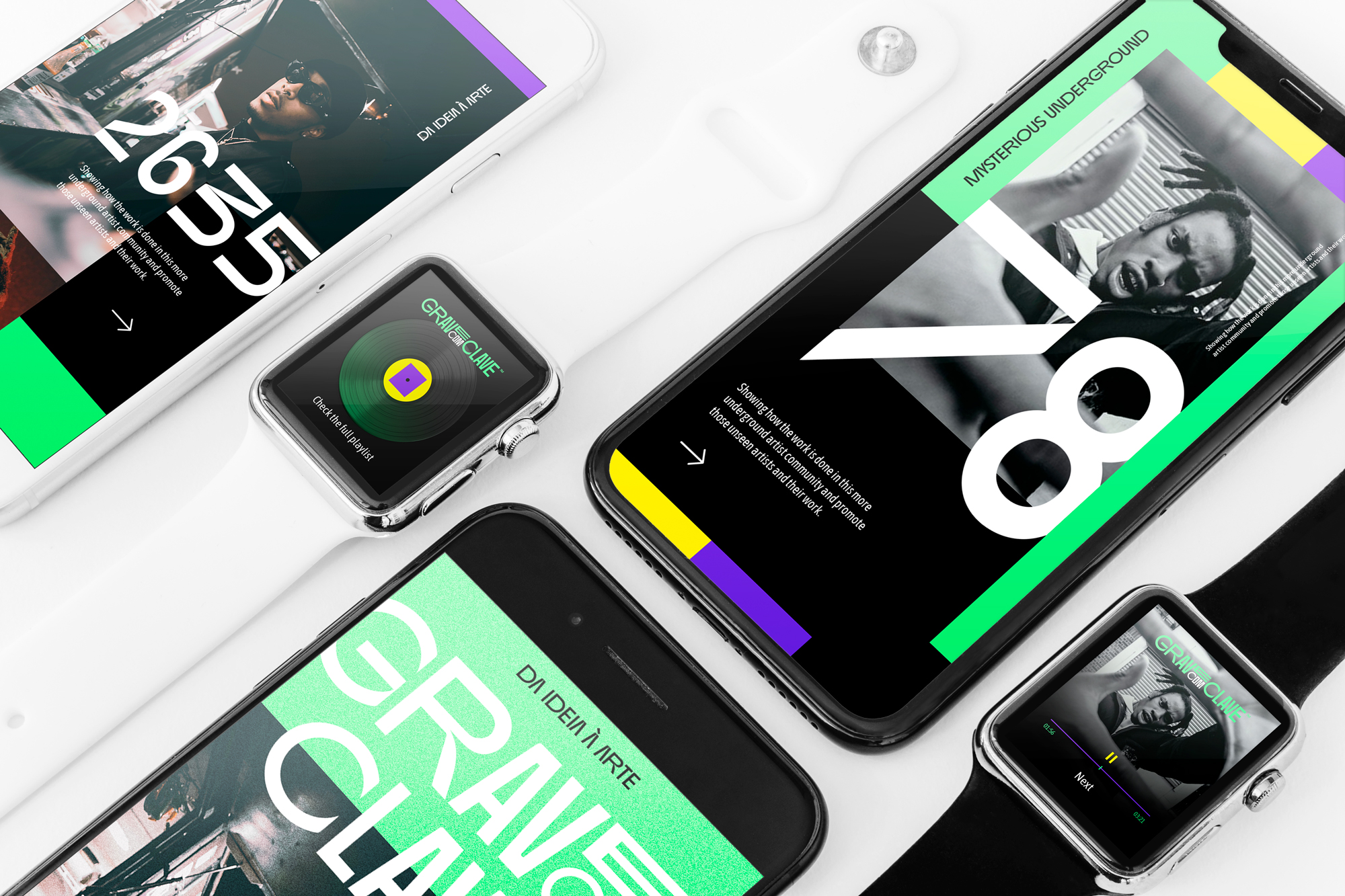
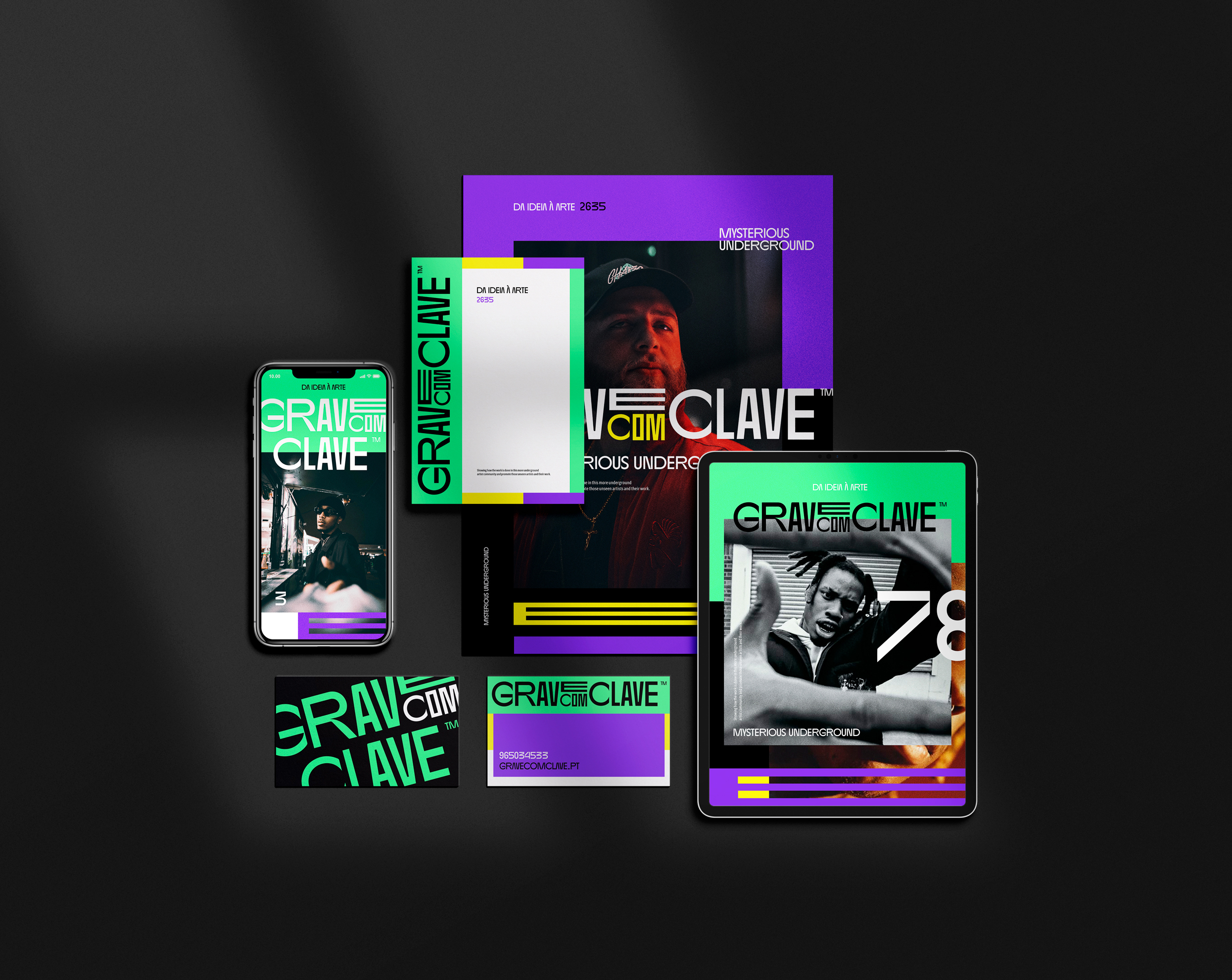
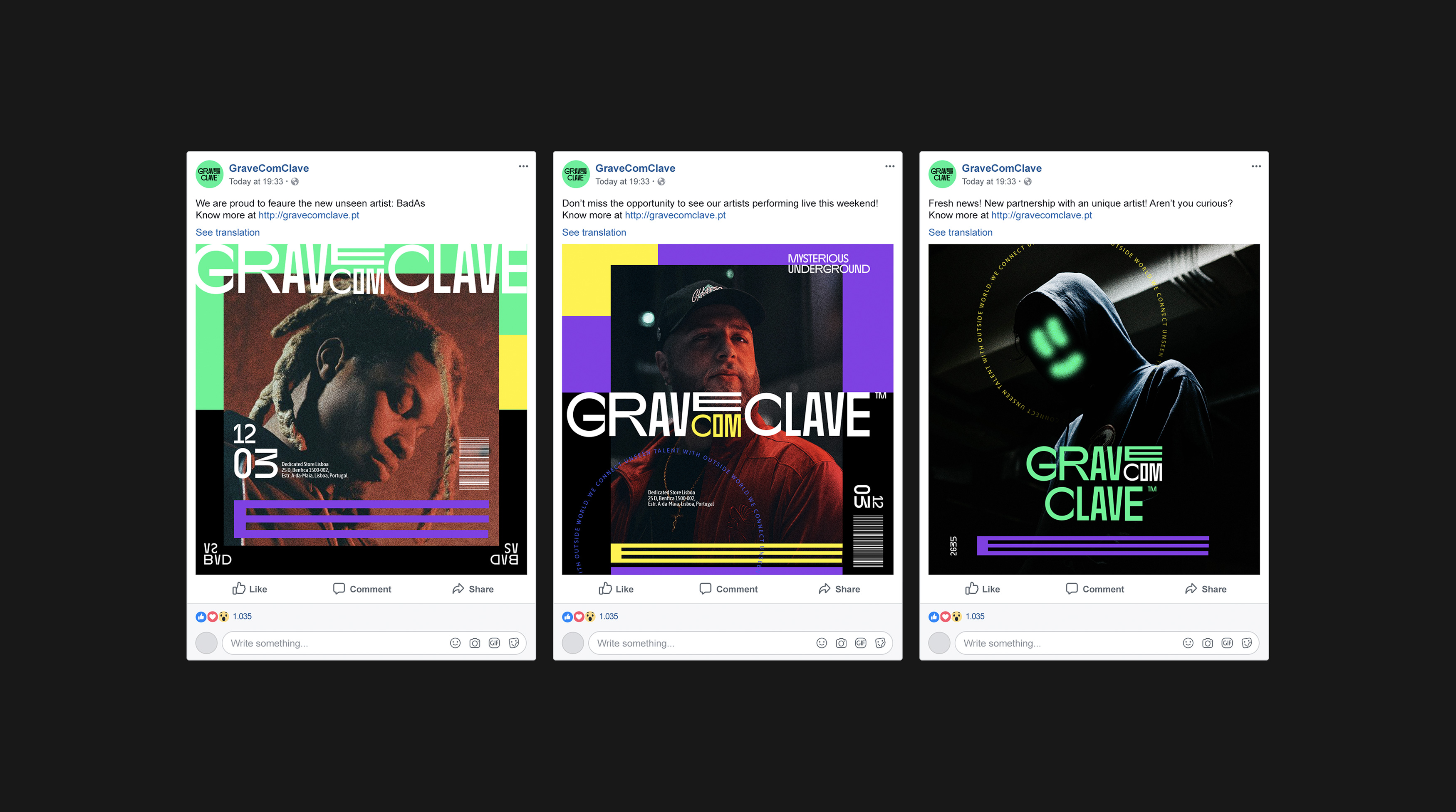
Creating a Unique Rhythm
We wanted to create a logotype that could reflect their core principles and their passion for music.
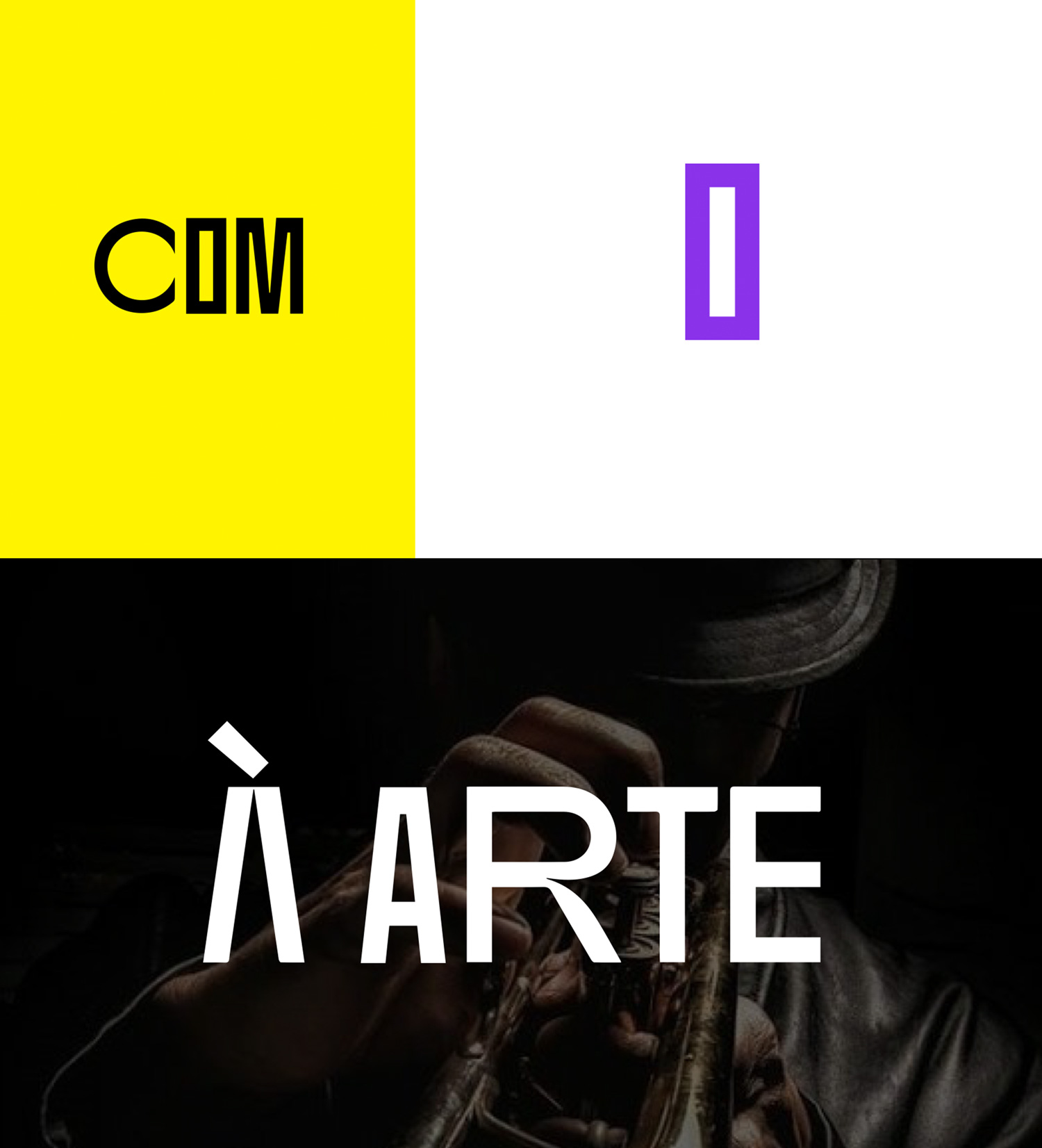
Typography & Color
We want the colors and typography to follow the same rhythm as the logo, being dynamic and approachable. Bold and serious. Fresh and vibrant. Genuine, honest, and contemporary. A contrast between the dark and mysterious and the vibrancy of life and music itself.
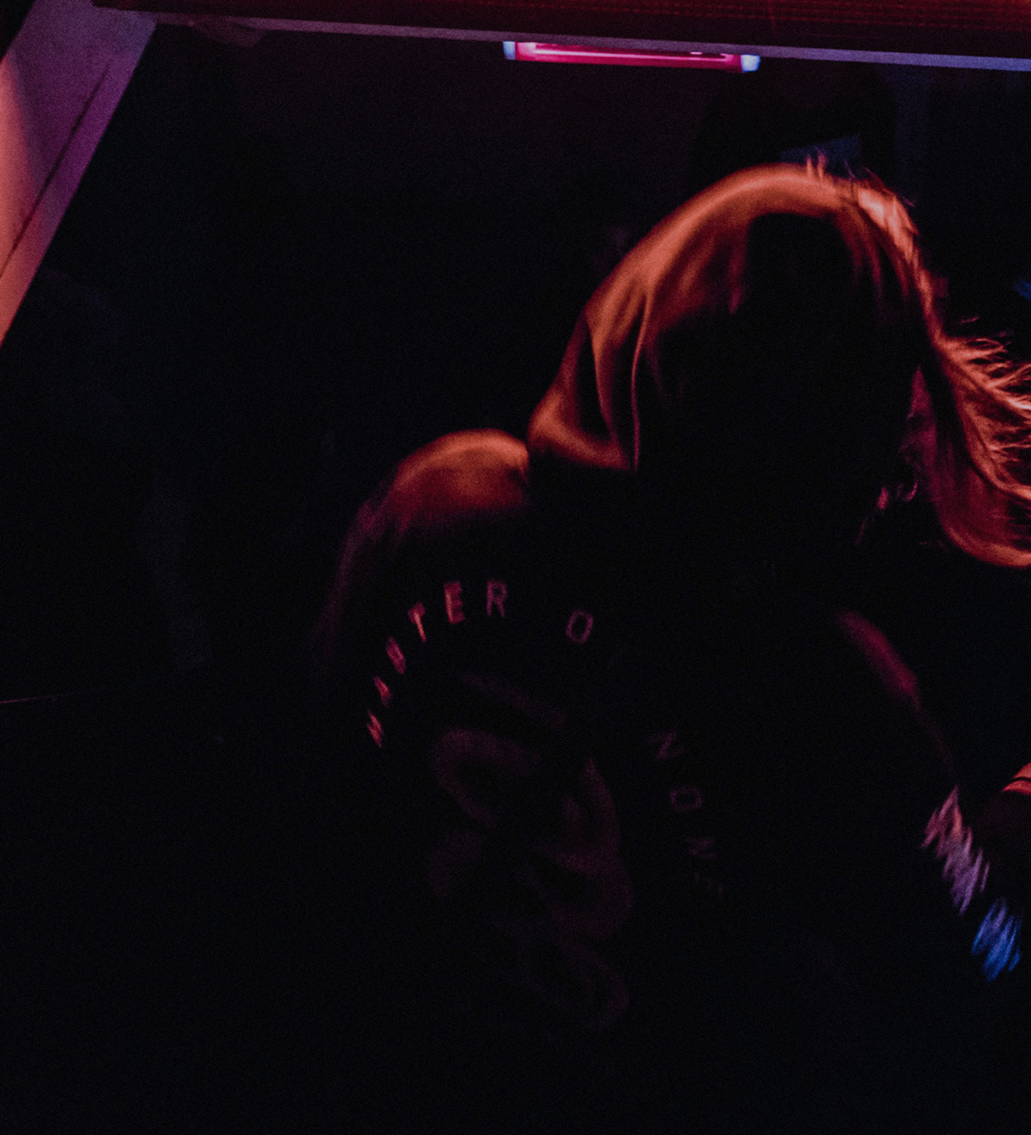
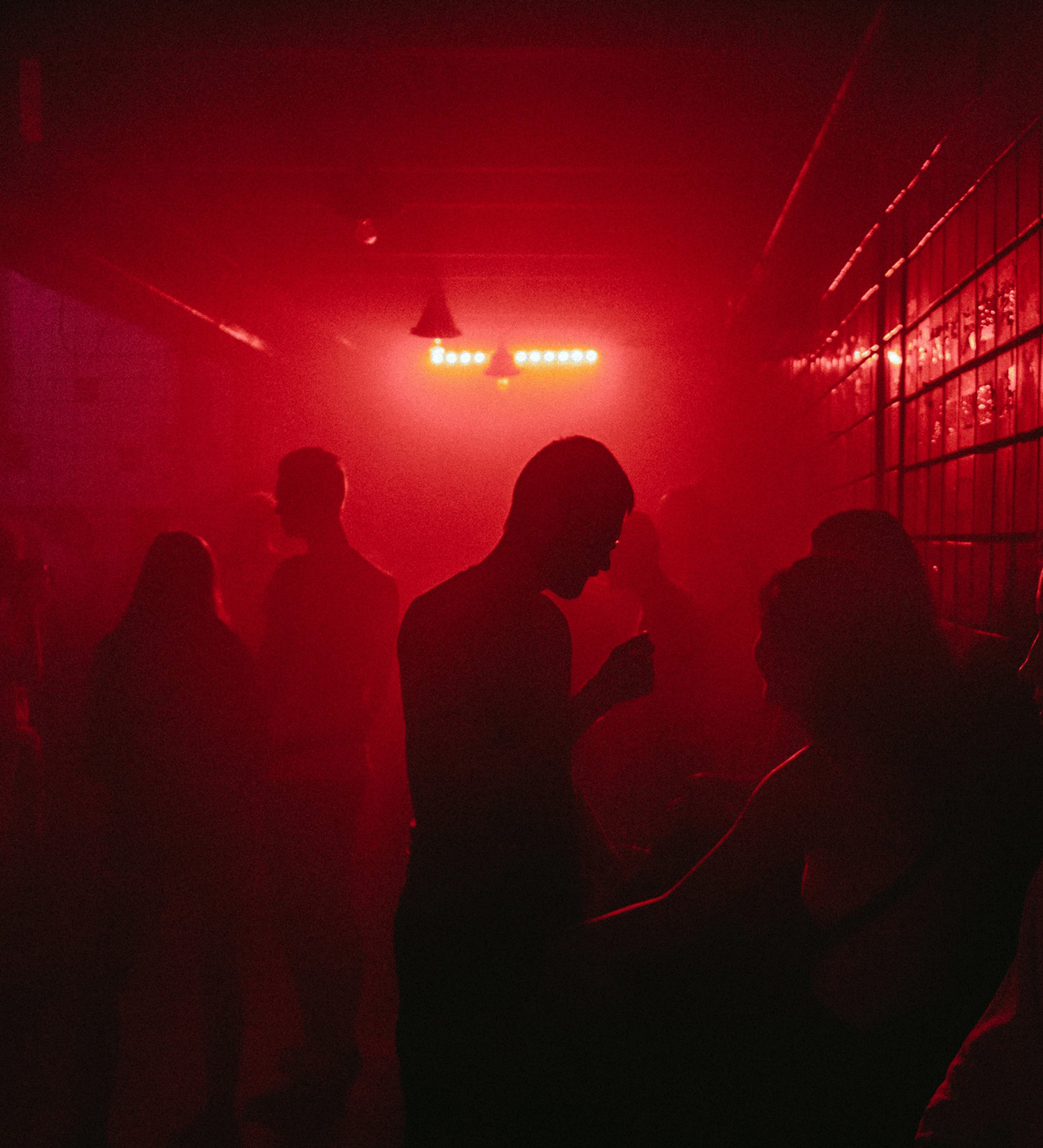
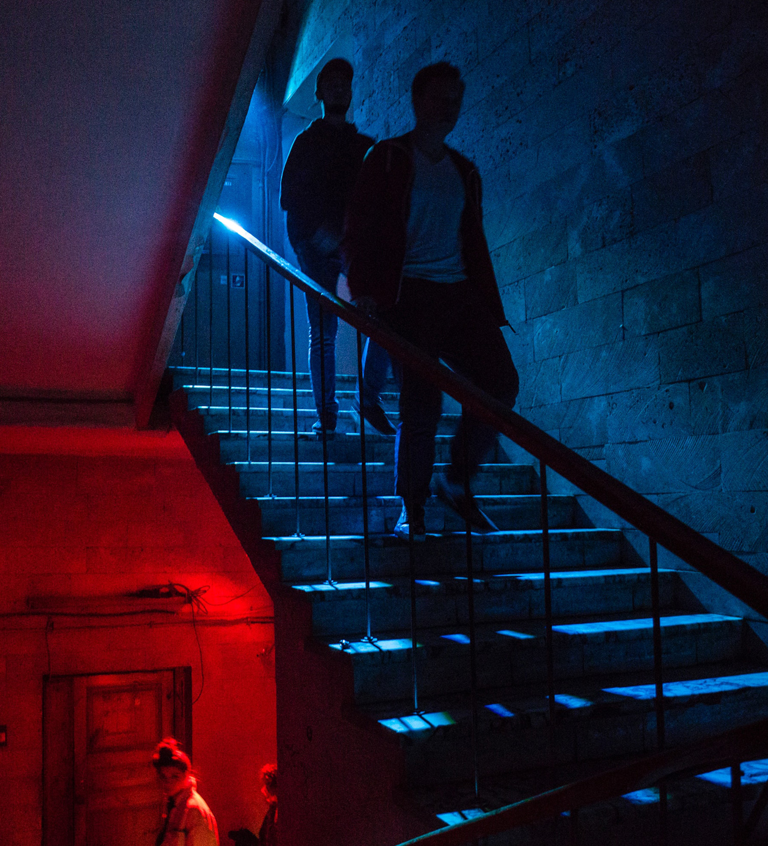
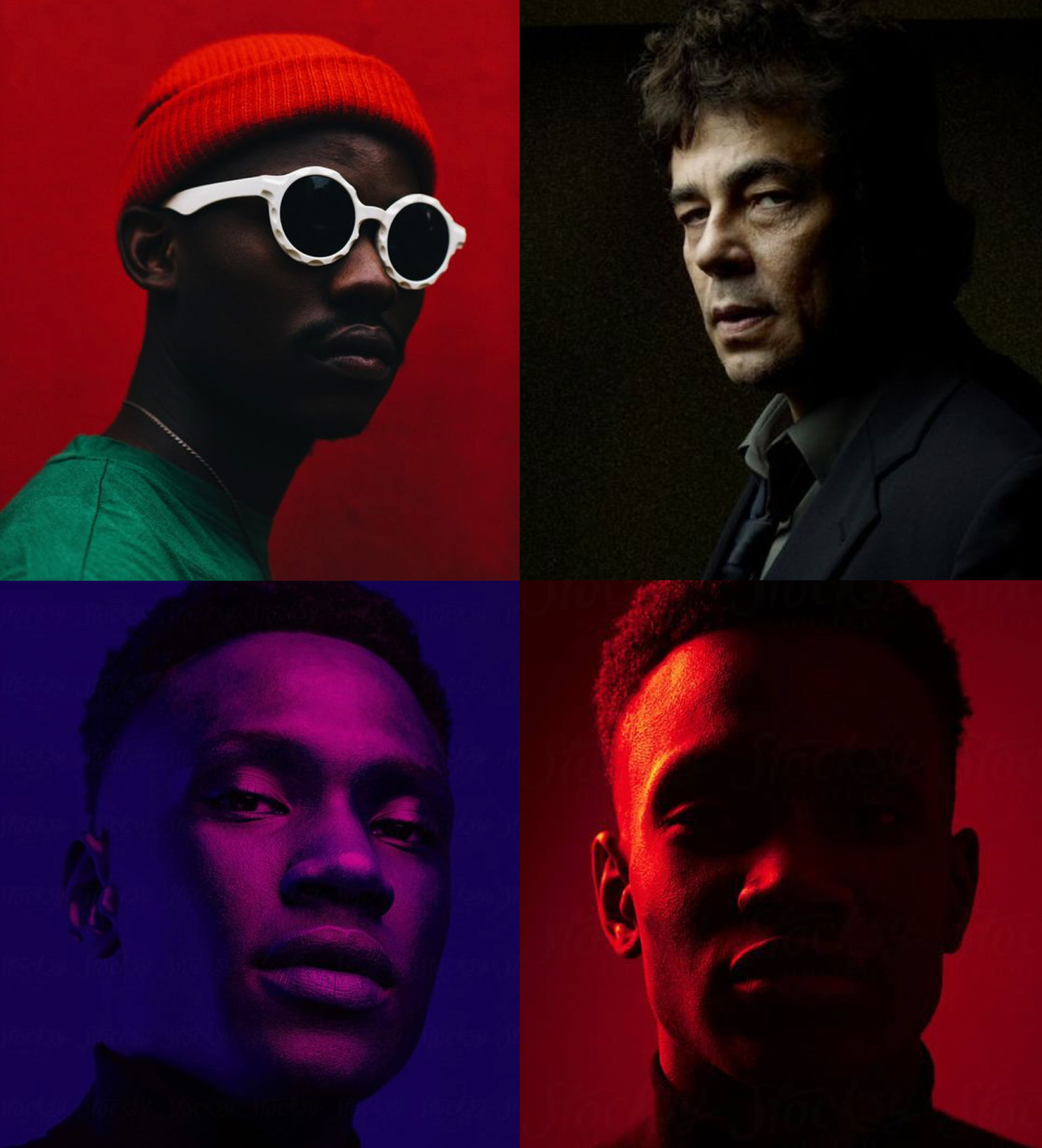
Keeping things Mysterious
For the photography style, we decided to go for a game of light and shadow. By playing with these extremes but complementary parts, we can surface mysterious, intense, and deep vibes. To achieve this aesthetics, the Rembrandt and Split light techniques were recommended.
Bold and Unique. Full Power, Full On.