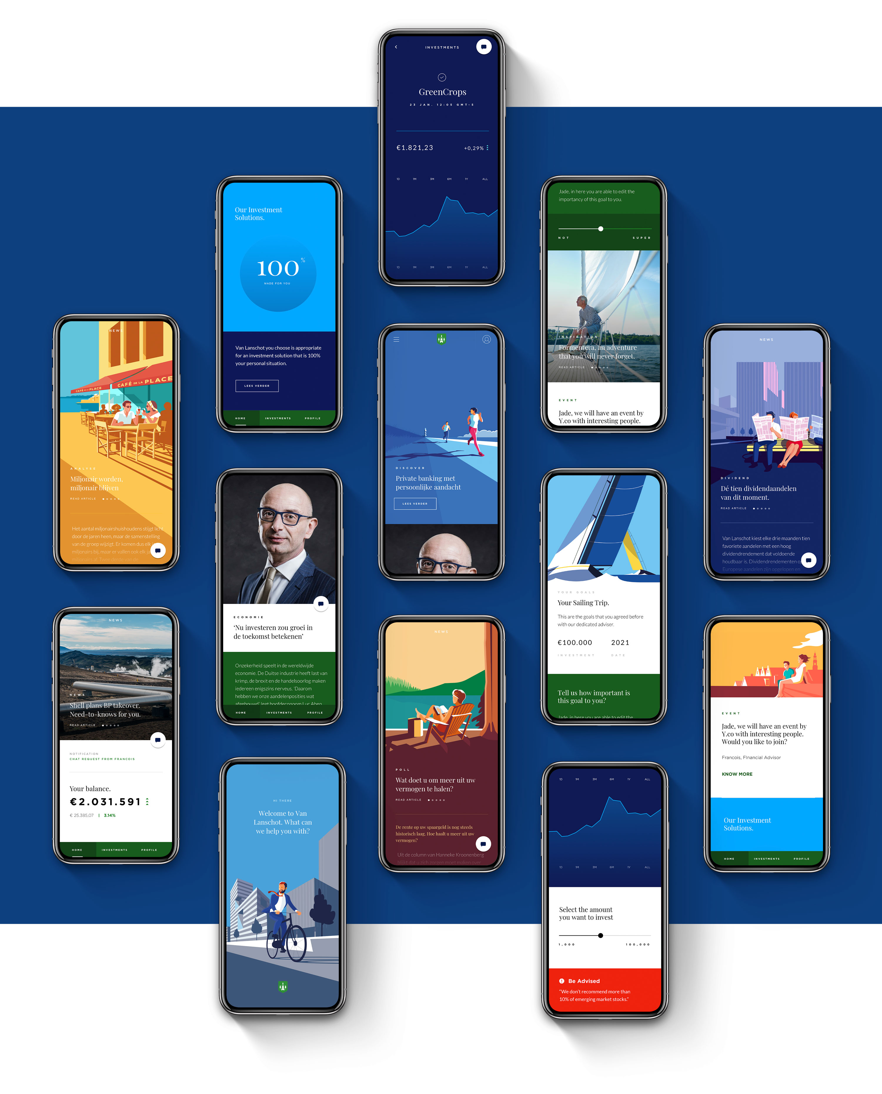
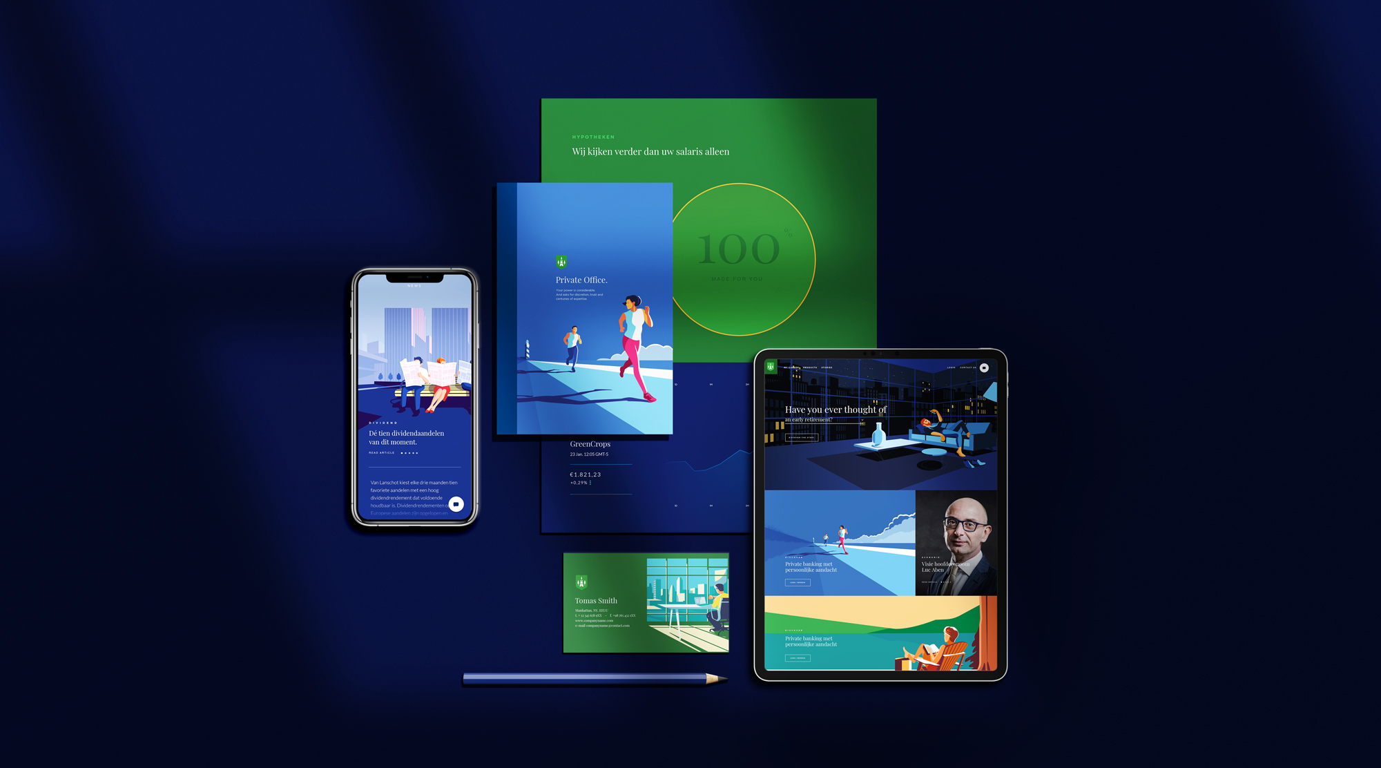
This project came to us when a private dutch bank was looking to refresh their look and approach. The brief was to deliver the vision for the Van Lanschot brand. A new art direction, tone of voice, channels, and a revised logo were developed.
The Revised Logo
For the creation of the new logo for Van Lanschot Private Bank, it was asked to us to bring something new but maintaining all the elements present in their logo. Brank heritage, history, values, and recognizability need to be kept. With this in mind, we decided to make it younger and vibrant but rooted in their origins.

The Vision
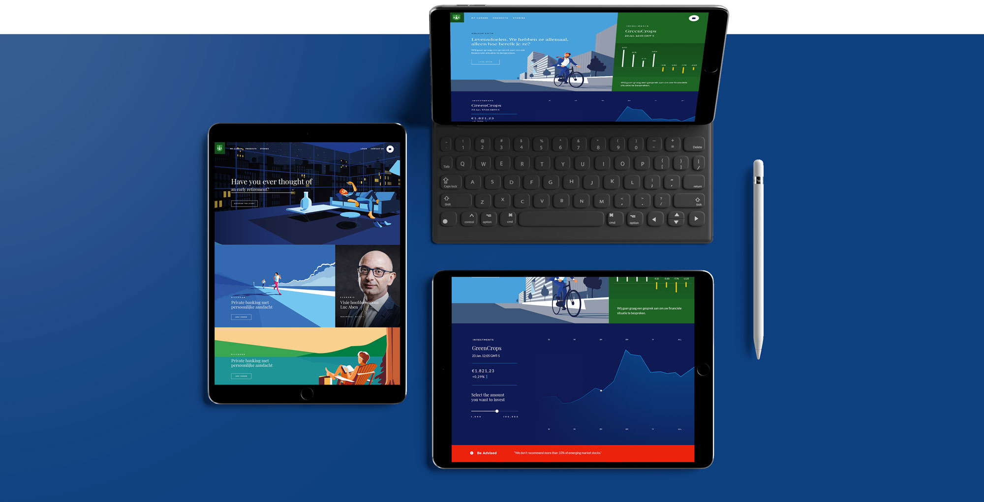
With this new vision, we change the approach dramatically. We made the brand more light-hearted. Van Lanschot is a bank with a lot of history, and it was associated only with the elite, and they wanted to change this mindset. To help them to do so, we used illustration as a way to tell stories. We tried to simplify some difficult subjects and give a more approachable, friendly, trustworthy, and honest feeling to their brand. All the illustrations were commissioned to Remko Heemskerk.


The Digital Experience
By using illustration and simple blocks of color, together with the photography and flat designs, with clear navigation patterns, we were able to make the brand feel uniquely younger and up to date.
